Friday, November 9, 2018

Watercolor Transfer Prints

Procedure

To prepare for this project we decided on two images we have edited in photoshop, and print them off. Next, we had to paint two pieces of cold press watercolor paper to fit our themes for the images. I did one with abstract blue and purple colors and one that was a rainbow ombre.
After this dried, we coated our image with a thick layer of mod podge. Next, we placed the image on top of our watercolor painting. We used a squeegee to remove all of the air bubbles to create a smooth surface for our image to transfer onto. After this process tries, you get your finger wet and begin to rub away the paper to reveal the image transferred onto your paper. After this step you are complete! Personally i really liked this project because got to experiment with my artistic side.

Monday, October 22, 2018

Printing Process

Image result for relief printing example


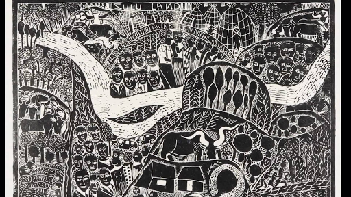
Relief Printing is the method of printing that consists of cutting or etching a printing surface. First, the artist will take a wood block and place a toning primer over the surface. Next, the drawing can be transferred onto the wood block by using an iron oxide or carbon transfer paper. After that, you decide what assets of the image you want to emphasize, or darken. You will use different sized tools to add different depth to the image. After completing this step, the image is ready to be printed. Black ink is rolled over the top of the image and then a baren is used to transfer this image onto a thin sheet of paper.


__________________________________________________________________________________________


Related image
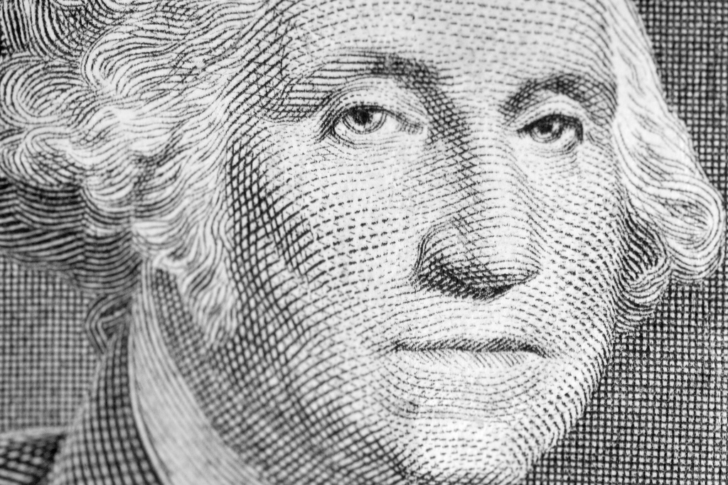
Intaglio printing is describe as the opposite of relief printing, in that the printing is done from ink below the surface of the plate. The ink is rubbed into the indentions then, the printing surface is wiped clean. To start this process, a tool called a roulette is used to start adding dimensions to the artwork. The purpose of this is to use different patterns and a variety of tone into the picture. Etching involves having to have lots of polishing and cleaning to the surface. Next you would need to apply a "ground" onto the image. Once it has been prepared with a ground, the smoking process begins. Where the coal is absorbed onto the image. Next, you will scratch at the all black surface to reveal the underlaying copper. The copper parts will be actually transferred onto your final result. After carving the image, you will begin a process called "etching". This process eats away at the bare copper revealed through the coal. Now, you image is ready to be printed. Ink is evenly distributed, and then a dampened sheet of paper Is placed on top of the image. The last step is that it is ran through the press with high pressure.


_______________________________________________________________________


Related imageLithography Printing  

is the printing process based off of the root word "lithos" meaning stone. This method is using the immiscibility of water and oil. First, the artist must use a greasy substance to draw the image on the lithographic stone. Next, the stone is chemically treated to establish the areas where water goes. One the drawing is established into the stone, you can replace the oil with any preferred color of ink. Other materials such as greasy pencils and crayons are used to create dimension and depth into the drawing. These materials are numbered, and the higher the number the more grease they contain. The greasier the utensil the harsher the line will become. This can be removed by taking this like razor blades or sand paper to remove the grease. Next you apply Gum Arabic to establish the whites in the image. After this you wash the image with lithotine. 
________________________________________________________________

Reflection 

In conclusion, my favorite printing method is relief printing. This is due to the fact that this is the method that makes the most amount of logical sense to me. I also feel like this method is the simplest and I would do exceptionally well with it.


Thursday, October 11, 2018

Personal Narrative Panorama 

For Spring Break of 2018, my family and I decided to take a vacation to Gulf Shores, Alabama. It is located on a beautiful beach bordering Florida. We decided to take this vacation because they offered many handicap accessible things that allowed my disabled sister to have fun on this excursion as well.

While I was there, I made sure to capture as much as I could. I personally find traveling so inspiring and interesting to see a different lifestyle. We spent some time at the beach, the environment there was absolutely beautiful. I also took advantage of the beautiful scenery at a place we visited called Alligator Alley. It consisted of stunning trees and greenery, very contrasted from the beach. I also visited a dolphin boat tour which was absolutely unreal.

Overall, I loved visiting Gulf Shores. It wasn't a too high profile spring break location so I didn't feel overcrowded. It was a nice and relaxing weekend and I thoroughly enjoyed it. My family and I are planning to visit again next summer so it'll be warmer and we will be able to take advantage of the beach. I loved that my sister got to be included in this, I could tell she really enjoyed this trip.

Reflection

I enjoyed being able to go back to these amazing memories and combine various images to create one image to capture the whole feeling of the trip. I included aspects from every part of the vacation. I even overlaid water and rock textures in the sky. I also overlaid greenery from the Alligator Alley, and added alligator skin over the building. I took advantage of the quick selection tool in this panorama, as well as the shortcut command J. Overall, I feel much more confident using photoshop.

Monday, October 1, 2018

Pop Art

We were assigned to take a photoshoot of an assigned partner, and transform them into a pop art inspired look. My partner was John Wallace, a unique boy one might say. From the photoshoot I made sure to get various shots in different positions. The first step I took was cutting John out of the picture using the quick selection tool, and using the shortcut command e to bring him to his own layer. Next I changed the background to a city scape, much more exciting than the Olathe Northwest Court yard. I was inspired by Warhol Arts repetitive imagery, his spontanious shapes, and his playful outlines. I used a variety of warm and cool tones to enhance the undertones in the background image. The combination of the inspiration Warhol Arts gave me with the personality of John Wallace complimented each other perfectly for pop art.

Tuesday, September 11, 2018

Photoshop Challenge 1

For this project we were assigned to take an image of a man and transform him using nature, or cityscapes. I personally love photography and editing photos, so I used images I took when I travelled to Gulf Shores, Alabama. I wanted to combine the water and nature aspect with the city buildings and the Ferris wheel. I actually created a purple hue over the building in order to be cohesive with the blue undertones of the Ferris wheel. In the background I put the bubbly water background, I thought it was detailed enough to add character to my image yet not take away from the cityscape. Overall, I thoroughly enjoyed this assignment and it strengthened my confidence in photoshop.

Friday, August 31, 2018

Photoshop Tutorials

                                                                                            Overview

For this assignment, we were tasked with watching video tutorials explaining the different functionalities and uses for the tools in Photoshop. We got experience with Content Aware Fill, the Patch Tool, Clone Stamp, Healing Brush, Spot Healing Brush, as well as combining all of these functions to create a Portrait Collage.


               Content Aware Fill                    _____________________________________

 For this tool, we were assigned to reposition the logo on this surf board. Originally it was about halfway down the board, we were supposed to create a version without a logo and then another with the logo moved up like the image above.


                                                                                   ________________________________________

Patch Tool

  For this tool, we were tasked with removing a logo from the mans shirt. It was a political logo, and he didn't want it to distract from the image. I used the patch tool to make the mans shirt look realistic.

Clone Tool and Healing Brush  


                                   Clone Stamp and Patch Tool

For these tools, we were assigned to remove a tag from the models clothing and then smooth it to make it look realistic. We used the clone tool to extend the sleeve over the tag to begin our removal. Then, we cleaned it all up using the healing brush.
__________________________

For this imagine, we needed to get rid of a pole protruding from the mans head. In order to do this, we used the clone tool to replicate the blue sky, then we used the              
patch tool to clean up the mistakes.
______________________________________________________                                                                                                                                                  

                                                               Spot Healing Brush


                                                        For the Spot Healing Brush, we were assigned to clean up an image of a young boy that had lots of dirt on his face. We used the spot healing brush tool to zoom in and get rid of the dirt, then we created a clipping mask to smooth everything.
______________________________________________________
 For our last assignment, we combined together the tools we have learned to create a photography portfolio. This was by far the most difficult and time consuming, however it was also the most worth it. I am pleased with the outcome and proud of my accomplishment.

Sunday, August 26, 2018

Self Portrait


For this assignment I chose to do a video with my two younger cousins names Alayna and Bella, they are 3 and 4. I feel that this represents how family oriented I am. It also shows my love and passion for kids. I wanted people to know this about me to see how compassionate I am,  and to know I'm their go to person if they're having a personal issue or need a friend. I was personally inspired by Drew Faflicks work because it was simple yet it showed his humorous personality. I also enjoyed Andrews banana film because it was very unique and kept me on my toes.

I shot my film at an angle the get both of my cousins and myself in the shot. I wanted myself to be in the shot because this video is about myself, so I figured it would be important for the audience to see who I am, interacting with my cousins. At one point I panned out to show the tent I was in with the kids, Bella had asked me to show it to the camera.

I hope my viewers can see my apathetic side of my personality and can get to know who I truly am. I do believe I was succeful in this and did an excellent job in the short amount of time I had to subtly get my message across. It was difficult for me to get the kids to stop being so cranky and to want to be in my video! I overcame this by bribing them fruit snacks and a movie! I personally like how adorable my cousins are and how spontaneous and random they are. If i were to this again I would most likely plan some more questions to ask them in advance. I learned to not read too much into what you want to do. This assignment is meant to show your personal creative side and I feel that your initial ideas for this represent who you are more than your final product.

In conclusion, I thouroughly enjoyed being in front of the camera and I look forward to a year in video! I would love to improve my skills and collaboration skills. I am looking forward to his year.


Video Final Blog Post Short Film Click here to watch my short film! This process took about 4 weeks to do including Pre-Productio...