Video Final Blog Post
Short Film
Click here to watch my short film!
This process took about 4 weeks to do including Pre-Production, a week for filming, and then a week for editing. The only major problems we faced in our piece was a lot of our crew being busy to prior commitments, and our actors lacking availability. I learned as a director you need to be a little more stern and less focused on getting your crew to like you. We got a lot of feedback on our continuity errors, which was inevitable due to some circumstances that came up. We had to change the amount of clips we had due to our cast members having to leave at certain times. Pre-Production went amazing and I think the storyline was good and the piece had loads of potential, however the actual production didn't do it justice.Classtime
I believe I mostly used my class time efficiently. There was always times in this class everyone would get off tased, however, I always made sure my work was done and completed on time. I usually didn't finish early but if I did I would always rewatch my work and see if there was anything else I could add to enhance my work. Outside of class I always watch television and movies and observe the shot sizes. I would also analyze the plot and think of the script writers.
Strengths
I feel like my strengths are more in the creative aspect in film. Thinking of the story and plot, planning locations and planning the innovative shot sizes. I also am decently strong in Post Production editing. I can maximize my strengths by just working hard in these positions I know I thrive in.Weakness
I am weaker when working behind the camera. I didn't want my lack of ability to come up in my piece so I took some time out of school to work with a bit of photography so I could gain a better idea of white balance, aperture, and other camera functions that would ultimately better my abilities behind a camera.Summary
My favorite thing about the semester was probably the music video. I had a lot of fun being able to create that montage and I think it turned out the best out of everything I did second semester. If I could change one thing it would be doing a larger variety of rolls within this semester. I am so excited to continue my video future in convergence next year because my favorite thing out of the entirety of the year was our ONW now sophomore edition. I have loved getting to spend the last 2 years with Mrs. Zimmerli and it really won't be the same without her.
Thursday, May 23, 2019

Tuesday, May 21, 2019
Sophomore Graphic Design Final


One of my favorite graphic design projects was the Color Font Typography. I have personally always loved fonts and calligraphy so this project was very fun for me to brainstorm and create. It personally took me a while to learn how to manuever the words, so I had to make a lot of them in different text boxes to get the font the way I really wanted it to be displayed. My teacher gave me constructive criticism and said I should add more smaller bees and when I did that I really liked the outcome of it. Personally I really love the quotes I chose and used.
 One of my other favorite projects was the concert branding. I felt my Vector portrait of Post Malone was my strongest piece all year. I loved this project because this is when I started feeling confident in my skills enough to venture out and do something super creative. I asked for my peers opinion of what color his shirt should be depending on the rest of the poster. Personally, I feel like my poster wasn't very good, however I loved my vector.
 I also had loads of fun creating my infographic and the beginning of the semester. This was at the first project I felt that we had this amount of freedom with and I think it turned out decently well. I had so much fun sketching this and making all of my own original graphics. My teacher recommended that I add a boarder or embellishment and I think its makes my piece that much stronger. I also had my peers help me a bit for what color the background should be.
I felt that I was fairly productive with the class time given. I always finished my assignments on time and if I ever had time left I would mess around with different designs or colors and make small tweaks and changes. I would ask my peers and my teacher for their thoughts on how I could improve things. Outside of class I notice myself focusing on logos and graphics and wonder if I could be capable of creating something like that and what tools they might've possibly used.
It is wild to think that a year ago I was doing a final learning how to code a website. Let's just say I am very glad that I chose to stick with video and graphic design strands. I feel like my strengths are definitely in pre production sketches and vector. I absolutely adored making my dog a digital creation and I hope in the future I can make more Vector Illustrations!
I think I mostly need to work on not losing hope with projects. A lot of times I get discouraged when I compare my work to some of my very talented peers. Once I let go of that hope It is hard to be proud of the work I am producing, so next year I hope to not compare my work to others. Also maybe staying a bit more on task and not talking quite as much.
Honestly, I loved this class as a whole. The environment and the people in 4th hour graphic design never failed to put a smile on my face. The one thing I can say is I think a bit more guidance in the beginning of the year would've been helpful. I understand it was Mrs. Beaudion's first year here and I think she did a phenomenal job, but I believe if more support and clear instructions were given on the beginning assignments I would've been able to thrive in this class earlier rather than just being abruptly thrown into it. My goal is to be confident in my work and stop comparing it to others. I need to develop my own unique style without the influence of others creative minds. Over all, I feel that this was a very successful year and I cannot wait to see what ways I can grow junior and senior year.
Friday, April 19, 2019
Click here to watch my trailer!
Breakfast Club Movie Trailer
For our project, we decided to recreate the Breakfast Club movie trailer. The story is about a group of teenagers from different stereotypes that all somehow wind up in the same detention room. Our piece got a lot of positive feedback on the audio overlay and blending, so I feel that this would be something to experiment more with my short film. It was a bit stressful finding actors, which I think was one thing we could improve on improving in the future. Searching for strong and reliable cast members. However considering that we had a bit of a struggle in casting, I feel that this really came together nicely in post-production. The breakfast club was also an easier trailer to replicate so we could spend more time focusing on editing it. I was really proud of our work because we used all of our own clips other than the one where the rebel fell through the roof. Looking at other groups, they used a lot more of the original trailers clips. I feel like with each project I get more and more excited about video and look even more forward to the next project in line. I also feel that my skills improve, not even just editing. I get a better eye for shot sizes and locations, and during this process I got very excited for the short film. I started to brainstorm ideas far in advanced, which allowed me to get really detailed with my idea. In conclusion, I really liked this project and I cannot wait to move onto bigger things in video.
Thursday, March 21, 2019
Music Video
Our group decided to do the song Love yourself by Hailee Steinfield. We chose this video because it has a very upbeat tone and has a super positive message we wanted to portray. Our group honestly didn't story board much, we mostly just took inspiration from the video and wanted to capture the overall tone but didn't want to copy the video frame by frame. I took the part as the lead role in the video and I also contributed a lot into the directing and editing. This video really helped me get more confident in editing in Premiere Pro, and our video specifically really allowed me to get better at sequencing. As for my technical skills, I didn't learn much about actually filming because I was in front of the camera but the fact that I spent so much extra time editing really allowed me to perfect my editing skills. Our group struggled with communication, but we worked through it by talking to Mrs. Zimmerli and being open with each other and still producing a video we all were proud of. I feel like I demonstrated a lot of leadership by encouraging my group to keep positive and not contributing to the negative feelings but trying to fix them. Our group managed this project well, we were one of the first groups to get a jump on filming but we needed to focus on getting as many clips as we could have and spent time wisely because we were still missing shots closer to the deadline. If I could do this project differently, I wouldn't chose a team off of who I am friends with. I would chose a team with people who are reliable, positive, communicative, and passionate about their work. I really loved being in front of the camera, and I feel like this will come in handy when I go into convergence next year because I know I would love to anchor. For my next project, I will be more certain of what shots we need before filming. I want my team to also spend our time more wisely so we can accomplish more and have more time to add polishing touches and really perfect our piece rather than just throwing it together. In conclusion, I really loved this project the whole way through. Even when it was tough I feel this was really a turning point for my knowledge in video. I also loved getting to see our over classmates videos.
Tuesday, February 19, 2019
Pre-Production
I started this process with having a lot of movie quotes, but I found a lot of times these didn't allow for the best graphics and the most creative opportunities. As I narrowed the quotes down I really started to envision the typography and the different fonts that would allow for these to come to life. I went to DaFont.com and started to download artsy fonts that I thought would fit the theme of my quotes.
Production
This was one of my favorite projects to watch come to life. I really wished I had more time to create graphics but I think the few that I did were simple but really added to the overall look of my quote.
Post-Production
Ironically enough the quote I did as a half joke actually turned out to be one of my favorites. It all just built off of each other and after the initial idea for the quote, I later decided to add the Shrek graphic to it. I also really am proud of my bible verse quote, I feel that the fonts really compliment each other and I enjoyed creating the simple bee graphics.


Wednesday, December 19, 2018
ONW Now
This was by far my favorite project I've had in video. This was what all of our other small feature news stories have allowed us to build up to. I've been watching ONW Now since I was an incoming freshman browsing youtube in attempt to learn some things about my future school. The process to making this piece wasn't at all how I anticipated it. Though I wasn't working on a feature piece, I still thought our class did a great job choosing topics that were relevant to our viewers attention. The laptops for example are a great way to keep students attention. As for the actual filming process, I didn't realize how many people were actually needed to shoot ONW Now. I was working audio which is just adjusting mics and muting the anchors when needed, but it actually was a somewhat stressful job. There was an abundance of people in the filming room and the back room where all the magic happened had even more people. My specific role in this production was word from the halls, even though this wasn't what I originally wanted to do it turned out to be a lot more fun than I anticipated. Our team got really festive with some Christmas onesies when we hit the halls! It was kind of embarrassing but I had Holly McCormick alongside me to make me look slightly less crazy. Overall, I really am proud of our class. I feel we all put forth our best effort and I am excited to see our final product.
Monday, December 17, 2018
https://account.adobe.com/profile?lang=en
Final Exam
Fall Leaves

We were assigned to use adobe illustrator to create 9 intricately detailed fall leaf icons. This project took approximately a week to a week and a half. I faced some minor challenges when creating this project because this was one of our first times working in Illustrator . I learned that it's okay to ask for help if you're struggling, I tried to problem solve a lot when I would face difficulties and asking for help proved to be a lot more affective. The teacher said she liked my unique color scheme.
I personally really liked this project and loved the final result. I worked fairly diligently and efficiently. When I thought I was finished I would go back through and play with the lay out as well as color scheme. Outside of class I pay close attention to graphics and critique their designs and color schemes. I personally think I am strong at design and layout skills, and knowing how to over all appeal to the eye. I think I could work on focusing more in class and spending my time more wisely
Raccoon

We were assigned to work in adobe illustrator to create a Raccoon. We were given about a week and a half to create this project. I faced some issues when making the tail have curved lines but once I asked for help I was able to teach others how to do it! I learned a lot about layering order. My teacher didn't really give me much feedback on this, but from my peers I received a lot of positive feedback. I had so much fun with this project and I really loved adding my personal touches and making him ready for the halloween season!
Info Graphic

This is what all of the other projects have prepared us for. We have had a lot longer to prepare for our infographic, in fact the final draft isn't due until after break. I am not currently finished but I am pretty far along. The teacher has helped me to improve my color scheme so it was easier to read. Ironically enough the hardest graphic to make was one of the smallest ones, the flexed arm. I problem solved though and figured it out. So far I have really enjoyed this process and feel that my true skill level is exemplified in my work.
Summary
Ive loved getting more comfortable with these software and getting to become more creative during the infographic process. To improve my work I plan to focus more in class as well as trying to find some endorsement work to practice my skills. My goal is to keep improving and keep showcasing my creativity. I really hope that as our year progresses that my skills will keep improving.
Overall, I have enjoyed graphic design a lot more than I did last year and I'm very glad I chose this as one of my two strands!
Friday, November 16, 2018
Procedures
click here to view my video!
For this project, my group and I wanted to take a different approach that other groups. We knew most groups would do late to class and signing out, and while yes those are vital procedures, bullying is a much more serious topic. We wanted to talk. about a topic that would be difficult to portray through film so we could challenge ourselves.
My role in this film was more story board and pitching ideas. I also made cameo in this film, as the person who sees her peer being bullied, and demonstrated how to report it. I feel like this was difficult to convey through such a short film and if more time allowed that it would tell the story in a more impactful way.
I feel that our group was very successful in casting roles and delegating tasks, everyone in our team found where they belonged and thrived. I think my personal strength would be story, and figuring out the shots that need to be implemented where.
I personally loved this project, and I feel like our teams videos really stood out compared to other groups. I loved my opening music. However, I feel that If I had to change something I would change the ending music and tie in more of a conclusion to understand that the bullies are leaving the student alone.
In conclusion, I really enjoyed filming and having the ability to come in touch with my love for film. Im really looking forward for the rest of this year, and my over all journey with Ecomm. I feel like this class really enhances my ability to view the world with a different perspective.
For this project, my group and I wanted to take a different approach that other groups. We knew most groups would do late to class and signing out, and while yes those are vital procedures, bullying is a much more serious topic. We wanted to talk. about a topic that would be difficult to portray through film so we could challenge ourselves.
My role in this film was more story board and pitching ideas. I also made cameo in this film, as the person who sees her peer being bullied, and demonstrated how to report it. I feel like this was difficult to convey through such a short film and if more time allowed that it would tell the story in a more impactful way.
I feel that our group was very successful in casting roles and delegating tasks, everyone in our team found where they belonged and thrived. I think my personal strength would be story, and figuring out the shots that need to be implemented where.
I personally loved this project, and I feel like our teams videos really stood out compared to other groups. I loved my opening music. However, I feel that If I had to change something I would change the ending music and tie in more of a conclusion to understand that the bullies are leaving the student alone.
In conclusion, I really enjoyed filming and having the ability to come in touch with my love for film. Im really looking forward for the rest of this year, and my over all journey with Ecomm. I feel like this class really enhances my ability to view the world with a different perspective.
Interview Feature News Story
The story that my group decided to feature was over the Northwest cheer team and their experience at NCA nationals. This project was supposed to be discovered in the classroom and fortunately enough I am a member of the ONW cheer team.
In the filming process, I was the director as well as the subject. Initially we had a different subject, however our subjects scheduledidnt correspond with when we needed to film so I was a last resort. It felt a little odd having so much control over this piece but I still incorporated all of my teams ideas.
Our pre filming process involved lots of location scouting. For our first subject it was difficult to find a relevant location that supported the story. However, our new subject allowed for us to work out a more efficient stage.
I was the subject as well as the director, I really enjoyed being in the piece I felt like I had more control over the over all tone of our piece. I loved directing and being able to make these final decisions.
My group did run into some technical difficulties with our audio. Considering this is our first time really working with audio our teacher didn't want us to waist time re-filming our piece. To make due with our situation we just completely did voiceover. For our entire interview. Not the most ideal situation but we managed to get through it to produce a mediocre video.
If I were to do something differently I would make sure we got our audio the first time around. Thats the only thing I felt that was missing from this piece and would improve it immensely.
I enjoyed the amount of B-Roll I had but I feel like I could've gotten some when I was actually cheering with a group rather than alone. I also feel like the outside clips really improved the impact of my piece, I would definitely keep those clips in.
In conclusion. despite every road block we encountered, this feature story really enhanced my comprehension for video. I am really looking forward to being able to film another feature news piece.
Our pre filming process involved lots of location scouting. For our first subject it was difficult to find a relevant location that supported the story. However, our new subject allowed for us to work out a more efficient stage.
I was the subject as well as the director, I really enjoyed being in the piece I felt like I had more control over the over all tone of our piece. I loved directing and being able to make these final decisions.
My group did run into some technical difficulties with our audio. Considering this is our first time really working with audio our teacher didn't want us to waist time re-filming our piece. To make due with our situation we just completely did voiceover. For our entire interview. Not the most ideal situation but we managed to get through it to produce a mediocre video.
If I were to do something differently I would make sure we got our audio the first time around. Thats the only thing I felt that was missing from this piece and would improve it immensely.
I enjoyed the amount of B-Roll I had but I feel like I could've gotten some when I was actually cheering with a group rather than alone. I also feel like the outside clips really improved the impact of my piece, I would definitely keep those clips in.
In conclusion. despite every road block we encountered, this feature story really enhanced my comprehension for video. I am really looking forward to being able to film another feature news piece.
Friday, November 9, 2018
Watercolor Transfer Prints
Procedure
 To prepare for this project we decided on two images we have edited in photoshop, and print them off. Next, we had to paint two pieces of cold press watercolor paper to fit our themes for the images. I did one with abstract blue and purple colors and one that was a rainbow ombre.
 After this dried, we coated our image with a thick layer of mod podge. Next, we placed the image on top of our watercolor painting. We used a squeegee to remove all of the air bubbles to create a smooth surface for our image to transfer onto. After this process tries, you get your finger wet and begin to rub away the paper to reveal the image transferred onto your paper. After this step you are complete! Personally i really liked this project because got to experiment with my artistic side.
Monday, October 22, 2018
Printing Process

__________________________________________________________________________________________
_______________________________________________________________________
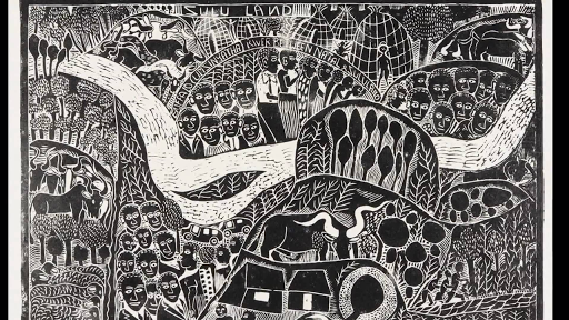 Lithography Printing
Lithography Printing
is the printing process based off of the root word "lithos" meaning stone. This method is using the immiscibility of water and oil. First, the artist must use a greasy substance to draw the image on the lithographic stone. Next, the stone is chemically treated to establish the areas where water goes. One the drawing is established into the stone, you can replace the oil with any preferred color of ink. Other materials such as greasy pencils and crayons are used to create dimension and depth into the drawing. These materials are numbered, and the higher the number the more grease they contain. The greasier the utensil the harsher the line will become. This can be removed by taking this like razor blades or sand paper to remove the grease. Next you apply Gum Arabic to establish the whites in the image. After this you wash the image with lithotine.
________________________________________________________________
________________________________________________________________
Reflection
In conclusion, my favorite printing method is relief printing. This is due to the fact that this is the method that makes the most amount of logical sense to me. I also feel like this method is the simplest and I would do exceptionally well with it.
Thursday, October 11, 2018

Personal Narrative Panorama
For Spring Break of 2018, my family and I decided to take a vacation to Gulf Shores, Alabama. It is located on a beautiful beach bordering Florida. We decided to take this vacation because they offered many handicap accessible things that allowed my disabled sister to have fun on this excursion as well.
While I was there, I made sure to capture as much as I could. I personally find traveling so inspiring and interesting to see a different lifestyle. We spent some time at the beach, the environment there was absolutely beautiful. I also took advantage of the beautiful scenery at a place we visited called Alligator Alley. It consisted of stunning trees and greenery, very contrasted from the beach. I also visited a dolphin boat tour which was absolutely unreal.
Overall, I loved visiting Gulf Shores. It wasn't a too high profile spring break location so I didn't feel overcrowded. It was a nice and relaxing weekend and I thoroughly enjoyed it. My family and I are planning to visit again next summer so it'll be warmer and we will be able to take advantage of the beach. I loved that my sister got to be included in this, I could tell she really enjoyed this trip.
While I was there, I made sure to capture as much as I could. I personally find traveling so inspiring and interesting to see a different lifestyle. We spent some time at the beach, the environment there was absolutely beautiful. I also took advantage of the beautiful scenery at a place we visited called Alligator Alley. It consisted of stunning trees and greenery, very contrasted from the beach. I also visited a dolphin boat tour which was absolutely unreal.
Overall, I loved visiting Gulf Shores. It wasn't a too high profile spring break location so I didn't feel overcrowded. It was a nice and relaxing weekend and I thoroughly enjoyed it. My family and I are planning to visit again next summer so it'll be warmer and we will be able to take advantage of the beach. I loved that my sister got to be included in this, I could tell she really enjoyed this trip.
Reflection
I enjoyed being able to go back to these amazing memories and combine various images to create one image to capture the whole feeling of the trip. I included aspects from every part of the vacation. I even overlaid water and rock textures in the sky. I also overlaid greenery from the Alligator Alley, and added alligator skin over the building. I took advantage of the quick selection tool in this panorama, as well as the shortcut command J. Overall, I feel much more confident using photoshop.
Monday, October 1, 2018

Pop Art
We were assigned to take a photoshoot of an assigned partner, and transform them into a pop art inspired look. My partner was John Wallace, a unique boy one might say. From the photoshoot I made sure to get various shots in different positions. The first step I took was cutting John out of the picture using the quick selection tool, and using the shortcut command e to bring him to his own layer. Next I changed the background to a city scape, much more exciting than the Olathe Northwest Court yard. I was inspired by Warhol Arts repetitive imagery, his spontanious shapes, and his playful outlines. I used a variety of warm and cool tones to enhance the undertones in the background image. The combination of the inspiration Warhol Arts gave me with the personality of John Wallace complimented each other perfectly for pop art.
Tuesday, September 11, 2018
Photoshop Challenge 1
 For this project we were assigned to take an image of a man and transform him using nature, or cityscapes. I personally love photography and editing photos, so I used images I took when I travelled to Gulf Shores, Alabama. I wanted to combine the water and nature aspect with the city buildings and the Ferris wheel. I actually created a purple hue over the building in order to be cohesive with the blue undertones of the Ferris wheel. In the background I put the bubbly water background, I thought it was detailed enough to add character to my image yet not take away from the cityscape. Overall, I thoroughly enjoyed this assignment and it strengthened my confidence in photoshop.
Friday, August 31, 2018
Photoshop Tutorials
Overview

Content Aware Fill _____________________________________
 For this tool, we were assigned to reposition the logo on this surf board. Originally it was about halfway down the board, we were supposed to create a version without a logo and then another with the logo moved up like the image above.
________________________________________

Patch Tool
For this tool, we were tasked with removing a logo from the mans shirt. It was a political logo, and he didn't want it to distract from the image. I used the patch tool to make the mans shirt look realistic.
Clone Tool and Healing Brush
Clone Stamp and Patch Tool
 For these tools, we were assigned to remove a tag from the models clothing and then smooth it to make it look realistic. We used the clone tool to extend the sleeve over the tag to begin our removal. Then, we cleaned it all up using the healing brush.
__________________________
For this imagine, we needed to get rid of a pole protruding from the mans head. In order to do this, we used the clone tool to replicate the blue sky, then we used the
patch tool to clean up the mistakes.
______________________________________________________
Spot Healing Brush
 For the Spot Healing Brush, we were assigned to clean up an image of a young boy that had lots of dirt on his face. We used the spot healing brush tool to zoom in and get rid of the dirt, then we created a clipping mask to smooth everything.
______________________________________________________
 For our last assignment, we combined together the tools we have learned to create a photography portfolio. This was by far the most difficult and time consuming, however it was also the most worth it. I am pleased with the outcome and proud of my accomplishment.
Sunday, August 26, 2018
Self Portrait
For this assignment I chose to do a video with my two younger cousins names Alayna and Bella, they are 3 and 4. I feel that this represents how family oriented I am. It also shows my love and passion for kids. I wanted people to know this about me to see how compassionate I am, and to know I'm their go to person if they're having a personal issue or need a friend. I was personally inspired by Drew Faflicks work because it was simple yet it showed his humorous personality. I also enjoyed Andrews banana film because it was very unique and kept me on my toes.
I shot my film at an angle the get both of my cousins and myself in the shot. I wanted myself to be in the shot because this video is about myself, so I figured it would be important for the audience to see who I am, interacting with my cousins. At one point I panned out to show the tent I was in with the kids, Bella had asked me to show it to the camera.
I hope my viewers can see my apathetic side of my personality and can get to know who I truly am. I do believe I was succeful in this and did an excellent job in the short amount of time I had to subtly get my message across. It was difficult for me to get the kids to stop being so cranky and to want to be in my video! I overcame this by bribing them fruit snacks and a movie! I personally like how adorable my cousins are and how spontaneous and random they are. If i were to this again I would most likely plan some more questions to ask them in advance. I learned to not read too much into what you want to do. This assignment is meant to show your personal creative side and I feel that your initial ideas for this represent who you are more than your final product.
In conclusion, I thouroughly enjoyed being in front of the camera and I look forward to a year in video! I would love to improve my skills and collaboration skills. I am looking forward to his year.
For this assignment I chose to do a video with my two younger cousins names Alayna and Bella, they are 3 and 4. I feel that this represents how family oriented I am. It also shows my love and passion for kids. I wanted people to know this about me to see how compassionate I am, and to know I'm their go to person if they're having a personal issue or need a friend. I was personally inspired by Drew Faflicks work because it was simple yet it showed his humorous personality. I also enjoyed Andrews banana film because it was very unique and kept me on my toes.
I shot my film at an angle the get both of my cousins and myself in the shot. I wanted myself to be in the shot because this video is about myself, so I figured it would be important for the audience to see who I am, interacting with my cousins. At one point I panned out to show the tent I was in with the kids, Bella had asked me to show it to the camera.
I hope my viewers can see my apathetic side of my personality and can get to know who I truly am. I do believe I was succeful in this and did an excellent job in the short amount of time I had to subtly get my message across. It was difficult for me to get the kids to stop being so cranky and to want to be in my video! I overcame this by bribing them fruit snacks and a movie! I personally like how adorable my cousins are and how spontaneous and random they are. If i were to this again I would most likely plan some more questions to ask them in advance. I learned to not read too much into what you want to do. This assignment is meant to show your personal creative side and I feel that your initial ideas for this represent who you are more than your final product.
In conclusion, I thouroughly enjoyed being in front of the camera and I look forward to a year in video! I would love to improve my skills and collaboration skills. I am looking forward to his year.
Tuesday, May 22, 2018
 Quarter 4 Project

 For this project, we were assigned to create a product and to create advertisements, logos, graphics, and much more to promote this product. We chose to do the Warp Watch, a watch that allows you to travel forward and backward through time. This project took the majority of our 4th quarter. It was challenging for me to come back to animation, given it was my very first rotation in e9 and it was difficult to recall some parts of the software. I learned how to cope with this, by sharing my ideas with someone who did have some better experience to make my ideas come to life. I also learned its important to ask questions and get a better idea of what you're doing. We changed our logo idea multiple times and had to simplify our advertisement to make it fit in 30 seconds. I am proud of what my team and I accomplished.
 Often times when i would finish something I would ask my teammates for their opinion on what I had done so i new what i could improve on. My team and I accomplished a lot this quarter. Outside of class I would look at everything with a different perspective, I was thinking of ideas for logos and how to make an efficient advertisement.
I thrive in graphic design, that is where my strong suit is. Although ultimately they thought my design was too complex for our product, so we went with Kate's. Of course I was disappointed but i realize it was what would be most beneficial to my team. I definitely struggle in web and animation, and could use improvement in that aspect.
 Overall, I loved being able to collaborate in a group. It held me more accountable to what I have learned this year and made me more confident in my abilities. I feel like next year you should try dedicating a day to having all the e9 classes combine and explain it all together, it would create less confusion. I know different teachers gave out different information, it may be easier just explain it once so everyone understood. This makes me more sure for next year, and makes me look forward to continuing with ecom. Next year i hope to get even better and video editing, and graphic design. I have loved being in Ecom this year, I am so glad i applied for this and transferred schools even though it was difficult i truly know i made the correct choice.
Friday, March 9, 2018
Web Project


This project was fairly quick once I got through a couple issues with my computer. There was an issue with the files being on the server, but with the help of Mr.Olson I got that cleared up. the only thing I didn't love about this project is that we all ended up with the same result, and we didn't really have an input in the turn out.
There is a contract shown through the text background color which is a light tan, and the black background. It makes the words pop and it draws your attention to the text. There is also a contrast being that the first sentence is bolded, and it intrigues the reader enough to keep them hooked in.
The text has a left alignment which is cohesive with the link at the top of the page. The whole text box appears to also be aligned left, with a thicker black strip on the right rather than on the left.
Repetition is displayed in the color scheme. They ask you to chose a dark tan from the dog as well as a light tan, which is used various times throughout this site.
As for proximity, there paragraphs are grouped together with a minimum of 3 lines. All text but the link are grouped together in a light tan box with rounded edges.
Through this project I can observe how CSS and Carp styles make a website look more appealing to the eye. These styles make these websites look more efficient and professional, and overall just makes it look more like a reliable and trustworthy site. I am excited for 4th quarter and to see how my group works together as well as how out website turns out.
There is a contract shown through the text background color which is a light tan, and the black background. It makes the words pop and it draws your attention to the text. There is also a contrast being that the first sentence is bolded, and it intrigues the reader enough to keep them hooked in.
The text has a left alignment which is cohesive with the link at the top of the page. The whole text box appears to also be aligned left, with a thicker black strip on the right rather than on the left.
Repetition is displayed in the color scheme. They ask you to chose a dark tan from the dog as well as a light tan, which is used various times throughout this site.
As for proximity, there paragraphs are grouped together with a minimum of 3 lines. All text but the link are grouped together in a light tan box with rounded edges.
Through this project I can observe how CSS and Carp styles make a website look more appealing to the eye. These styles make these websites look more efficient and professional, and overall just makes it look more like a reliable and trustworthy site. I am excited for 4th quarter and to see how my group works together as well as how out website turns out.
Friday, March 2, 2018
Who are you?


I am an ESFP, which stands for Extrovert, Sensing, Feeling, and Perceiving. However in all of these I was in a lower percentage, which means I am pretty borderline. I think it is pretty spot on with my personality, it describes ESFPs and performers, and very social people. I am in cheer and I love to perform, I also really enjoy being around people. It usually always puts me in a better mood. I feel like its also spot on when it says we like to stay busy, because I do. I absolutely hate being bored, I get stir crazy after staying home for a day. I am also really good at adapting to my surroundings, sense transferring to Northwest this year and trying out for cheer. Its also right when it describes ESFPs as flexible and down-to-earth, I'm really good at just going with whatever is happening.
As for my LOGB profile, my scores were all fairly close to each other. My 2 highest that I feel represent me most were the Lion and the Beaver. I am a very strong and direct leader, but I am not argumentative. Thats were I feel like I am more the a Beaver, high standards and very optimistic. I am encouraging to my group but my weakness definitely is having unrealistic expectations, which is VERY frustrating in group projects when not everyone is doing their part
Thursday, March 1, 2018
Logo Design


This logo design project started out with a LOT of sketching. I am somewhat of a creative person, so sketching was by far my favorite part. I had so many ideas it was almost overwhelming. I would get ideas at random times, once even during a math test where I preceded to sketch it out ON my test. My math teacher actually wrote on it and asked me if it was my trademark. It was such a fun process and I really made a lot of things I was proud of.
Once it was time to do it on Adobe illustrator, I wasn't really nervous at all because I am fairly comfortable with the software. My logo had to have some altercations and I worked through them. It was really interesting actually seeing my logo, not only on a screen but being able to see it on t shirts and signs. I chose my color to be a dark maroon because it symbolizes warmth and wholeness. Overall I had a lot of fun in Graphic Design and I am excited to learn more about it next year.
Subscribe to:
Posts (Atom)
-
 Sophomore Graphic Design Final One of my favorite graphic design projects was the Color Font Typography. I have personally always love...
 -
 Web Project Final Overview~ To be quite honest I was not looking forward to this final, but to my surprise I ended up enjoying this pro...
 -
 Here is my group and I working. Sidewalk Chalk We chose the main theme and idea of our chalk drawing to be the earth. It symbolizes t...